Sunday, October 15, 2017

Creating an entryway when there isn't one


I have a thing for big beautiful foyers. One with a round table sitting in the middle of the room stacked with pretty books and a vase of seasonal branches. Or a unique entry table with a pair of matching lamps. Maybe I have this obsession because we don't really have a proper entryway. The good news is, you can carve out a functional space to welcome you and your guests almost anywhere.


We do have a coat closet opposite the front door and it works fine for our guests coats and shoes, but since this is one of only two closets on the main level (old house problems) it has to be multi-functional. And I have to admit, I haven't taken any time to make it look pretty on the inside. Honestly, its a total disaster waiting to happen if the door opens. Yikes!


This little area came together slowly. I started with a small bench for guests to sit and remove their shoes (we don't wear shoes in the house) but it always felt like it was floating a bit. Coat hooks were on my radar but I was terrible about committing and kept putting it off. (Does anyone else feel like hanging things on old plaster walls feels so permanent?)


To get an idea of the layout, here is a view of our living room looking towards the front door before the hooks were hung.

(The little white  door opens to our mail slot in case you were wondering)

I bought a few of my favorite black and white coat hooks from Anthropologie but after holding on to them and not pulling the trigger to hang them, I knew they weren't quite right. I needed something with a back plate for more weight. I was surprised when I found these light and airy hooks at Hobby Lobby for a great price, I always forget how good their hardware selection is. These came as a set of three so I just hung two of them together to get the length I wanted. 


All we need now is for someone to clean out the coat closet (that would be me) and to find a rug to go in front of the door. I'll probably look at Ballard Designs, their indoor/outdoor rugs are so easy to clean outside with a spray down from the hose. I have one at our back door, that opens right into our family room. This is the door we use everyday. Another non-entry situation solved with hooks, a big basket for shoes and a garden stool to sit on. 


I store seasonal essentials in hanging baskets to grab and go. Sunscreen, bug spray and swim goggles for summer and hats and gloves in the winter. Its not ideal but it works. 


Tuesday, August 29, 2017

Our comfort works custom slipcover

Oh my goodness you guys, I couldn't be more excited about the new farlov sofa covers from comfort works! 


After getting my fabric samples in the mail, I narrowed it down to a few favorites. I went with a light gray cover called kino ash to tie in with the dark gray family room that you can see through the doorway. I was really tempted by the suede for fall and winter. I might have to order one more.


If you read my Ikea farlov sofa review here, you know I didn't like the slipcover that came with the sofa. It had a very textured look and didn't feel comfortable to the touch. I wanted our custom slip covers to be soft and I wanted more color options. In hindsight, I would have just bought the sofa and not the cover that Ikea offers.


The look and feel of the fabric I chose is perfect for us. It's durable, washable, and fits our sofa so well. I am really so impressed!


I was curious to see how the replacement covers would fit compared to the one that came with the sofa. I'm happy to say that this cover couldn't fit any better, It went on easily and looks amazing!


I love the helpful tags showing which cover goes where. 


Our living room is feeling so cozy now, just in time for fall. I'm ready to do some serious cuddling with my little family here. 


"This blog post was sponsored by (Comfort Works) I received a slipcover in exchange for my honest review"

Friday, August 18, 2017

Ikea Falov Sofa Review

When it comes to buying upholstered pieces, I go one of two ways; buy the very best you can afford and it could last a lifetime, or buy something inexpensive, knowing it will have to be replaced down the road. 

When I was in my twenties I purchased a floor model sofa from Ethan Allen for a great price. It was well loved for years until the fabric wore out and it needed to be reupholstered. Having large furniture reupholstered isn't cheap, I think I paid around two thousand dollars including the fabric about ten years ago. The cushions held up great over the years and they never looked squished or saggy but the piping on the seats was starting to wear out again. It was time to take a good look and decide if I was going to invest in this piece of furniture again and have it reupholstered for a second time. I realized I wanted something a little longer with a washable slipcover. 

I've been eyeing the slope arm sofa from Restoration Hardware but it had mixed reviews about the cushions not looking good after a while and I didn't want to take a chance because of the price. Then when Ikea came out with their new Farlov line it stopped me in my tracks. They are not identical but there are similarities. 


                                                                      RH Slope Arm Sofa


I was excited to check out the Farlov because the price is amazing, it has a washable slipcover and its really deep, which we like for lounging. I also like the simple arms, much less bulky than our previous sofa. 

The first thing I noticed about the Farlov was the fabric on the slipcover. It isn't very soft and has a weird textured look that I didn't like. I knew right away this sofa would be amazing with a custom slipcover. 


As far as comfort goes, it's definitely not as comfortable as the Ethan Allen sofa was, you don't sink into the cushions the same way. But the depth, single seat cushion and slipcover sealed the deal. I'm excited to have a new slipcover made from a company called comfort works. They make beautiful slipcovers for Ikea furniture and custom covers as well. 

I can't wait to show you what I chose! Follow along on Instagram if you don't already.


Tuesday, May 16, 2017

Kitchen before and today

Hello there! Since we have been picking away at phase two of the kitchen renovation, I thought it would be fun to share some before and in progress pictures with you.


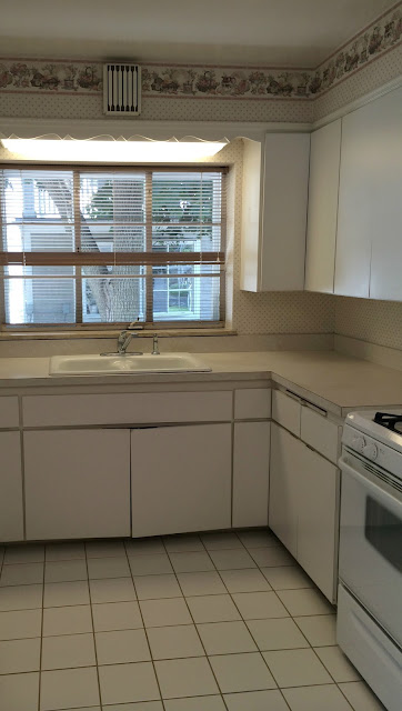
To recap our journey, we gutted the kitchen right after we closed on our house, a couple weeks before we officially moved in. The kitchen was old and in bad shape, so we knew right away we would be starting fresh. I wanted all the messy work out of the way before we moved in if possible. 


After having the tile floor ripped out and oak hardwood floors installed to blend with the original, we ripped out the soffits to see what we were working with. With any small kitchen storage is key, so cabinets would go to the ceiling if possible. I'm ok with getting on a stool to reach items stored on the top shelves that aren't used very often. 


Taking the soffits down created a problem, the heavy plaster ceiling didn't have anything to hold on to and was no longer secure. Having a new drywall ceiling wasn't in our original budget or timeline but with any old home things are going to pop up, or in this case fall down. I was so happy a bunch of mouse poo and icky stuff didn't fall from inside the ceiling. It seems like that always happens on the renovation shows right?!


I was a bit worried about the newly installed floors hiding under those tarps, surprisingly they were fine. We hired the drywall out but unfortunately the guy doing it was very slow. The pressure was on to get the drywall mess done at this point because the new owners of our previous house wanted to move in. They were more than generous to let us stay a couple extra weeks so we could at least clear the dust. 


We also hired an electrician to add pot lights in the ceiling since the only light source was over the sink and kitchen table. Our last kitchen never felt bright enough at night so good lighting was important when able to start from scratch. 


We moved into the house without a finished kitchen, it would be six weeks before we had the time set aside to put it back together. That gave us time to figure out a layout and materials. After reading many reviews and blog posts about Ikea cabinets, we ended up going with the Adel cabinet and wood countertops. I liked the shaker style doors and soft close drawers, and of course the price point is great. 


We used the software available at Ikea to design the space and fit everything in like a puzzle. Our little kitchen never had a dishwasher (for almost 80 years) so that was a must on our list. I used an integrated cabinet door over the dishwasher, it helps with flow since it is such a small space. Too many stainless appliances in a tight space would have been too much. 


It only took us two years to get back to work on the kitchen (insert sarcasm) Life of a DIYer can be slow at times, especially when it comes to the finish work. We still needed to add crown moulding to the cabinet tops and tile. I knew I wanted to use mini subway tile since the kitchen is small, and I wanted to take it to the ceiling. We are tile rookies so it took us about three full days to install and grout. It still needs to be caulked and the moulding needs to be finished but we are almost there!


Here is a look at the banquette on the other side of the kitchen. We eat most of our meals here, do homework and just hang out together. Its the workhorse of the kitchen for sure. You can read more about the banquette here.

Thursday, March 23, 2017

The kitchen banquette

This weekend we will be finishing our little kitchen by tiling the backsplash and adding trim to the top of the cabinets. Sometimes we jump around from project to project and finish things as we have the time and resources. Tile has been put on the back burner as other more important projects jumped in line, so I'm excited to see it finished. As we prepare for the big backsplash tile project of 2017 (this is our first time) I thought it would be fun to see what the other side of the kitchen looked like when we bought the house and before we built the banquette. 


The house came with a lot of wallpaper and the kitchen had a lovely scallop trim to go with it. 


Luckily we found original hardwood floors throughout most of the house except for the kitchen and family room which was an addition at some point. You can see a peek of the family room to the right of the kitchen.


We had a small window of time to work on the house before we moved in, school was starting and the new owners of our previous house wanted to move in. The goal was to get a lot of the messy stuff done, so we gutted the kitchen, and had hardwood floors installed in the kitchen and family room.


The old plaster walls needed a bit of work after the wallpaper was removed. 


The banquette came about seven months after we moved in, but I knew this was the perfect spot for one the first time I saw the house. We are an eat in kitchen kind of family, and a banquette would be the most practical and attractive option for our tiny kitchen. 


My husband built the bench seating, and included some much needed storage inside. One very important tip when building or having a banquette built is to be sure to have a nice deep overhang on the seat. It allows your legs to have room to naturally swing back like sitting in a chair verses sitting on a box. 


We used plywood ripped down at Home Depot and nickles for spacing to get a planked shiplap look.


One coat of primer and two coats of my favorite advance paint by Benjamin Moore finish it off. 


I couldn't have imagined how functional this space would end up being for our family. It's comfortable, cozy and we spend a lot of time here working, eating and doing homework. 


Site design by FABULOUS K CREATIVE